Atfarm – Optimising Precision Farming with a React Native Mobile & WebApp
Enhanced UX/UI Boosts Engagement, Usability, and Market Reach for Atfarm (Transforming Precision Farming)
Overview
Atfarm by Yara ( global leader in crop nutrition, ammonia and essential industrial solutions) is a complimentary online service designed to assist farmers in overseeing biomass through satellite imagery and implementing variable-rate fertilization. The platform is dedicated to supporting farmers in efficiently managing crop nitrogen.
The Problem - Onboarding drop-off
Drawing from data gathered during the advertising campaign journey in Brazil in 2024, it was observed that only 13% of the users who installed the app went on to complete the registration process. Out of a total of 231,962 app installations, the number of users who actually signed up amounted to 30,348.
My role : Lead Product Designer
Drive design strategy by aligning user needs with product goals.
Lead end-to-end design from research to execution, ensuring usability and consistency.
To understand what blockers/pain points farmers may have from signing up to field creation.
To explore how we can improve the flow and make the experience more engaging.
Improve and maintain design systems, and clearly communicate concepts to stakeholders for alignment.
Let’s first understand the audience and the business goal
Understand target audience through data
Analyse data such as traffic sources, user engagement, bounce rates, and conversion funnels to understand who is visiting the platform and they were interacting with it.
Workshop to gathering insights
Gathering feedback from users, stakeholders, and team members to identify areas for improvement and future enhancements to the application. Participants: 9 Externals: • 1 UK farmer • 5 BR farmers & advisors
Competitive Analysis
Benchmarking the design against competitors and industry standards to identify areas for improvement and opportunities for differentiation. This involves analyzing design trends, innovations, and best practices in the relevant market.
Actions to Reduce Onboarding Drop-Off and increase in conversion rate
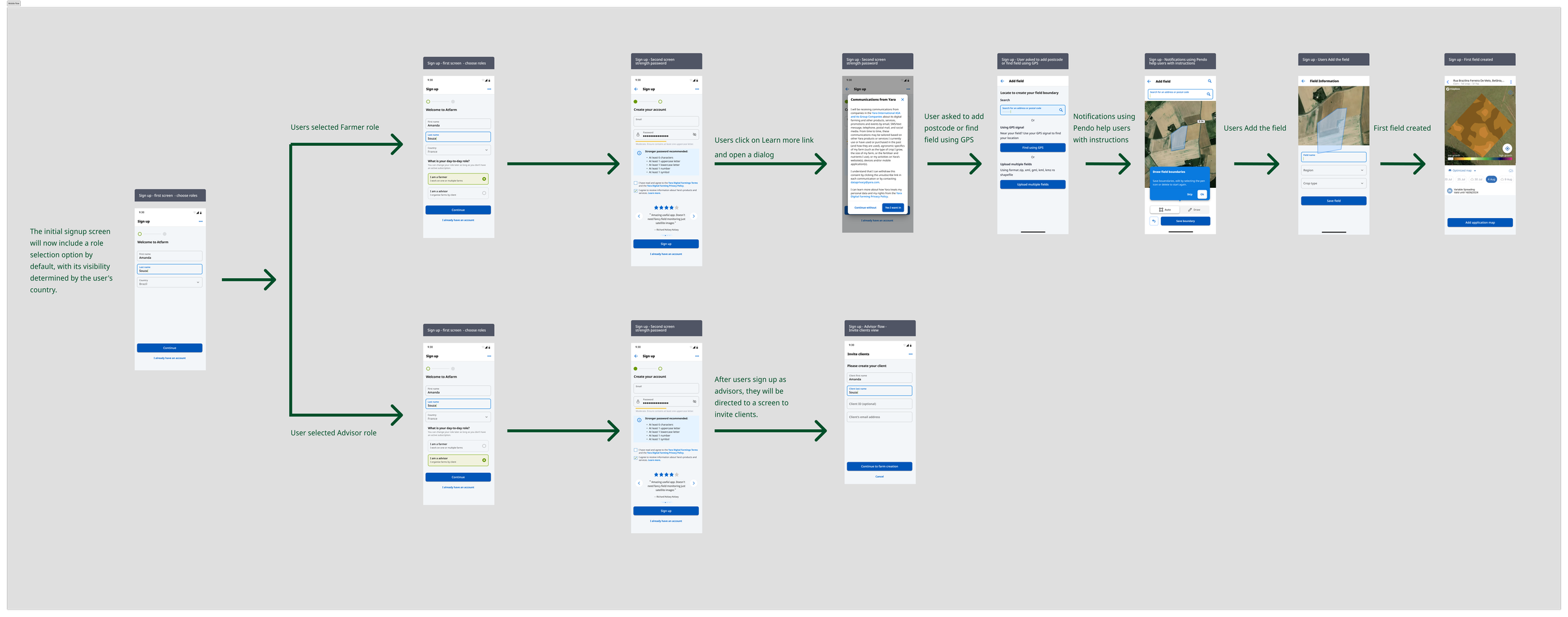
Improved onboarding with secure password suggestions.
User reviews for trust.
Consistent branding via our new Design System.
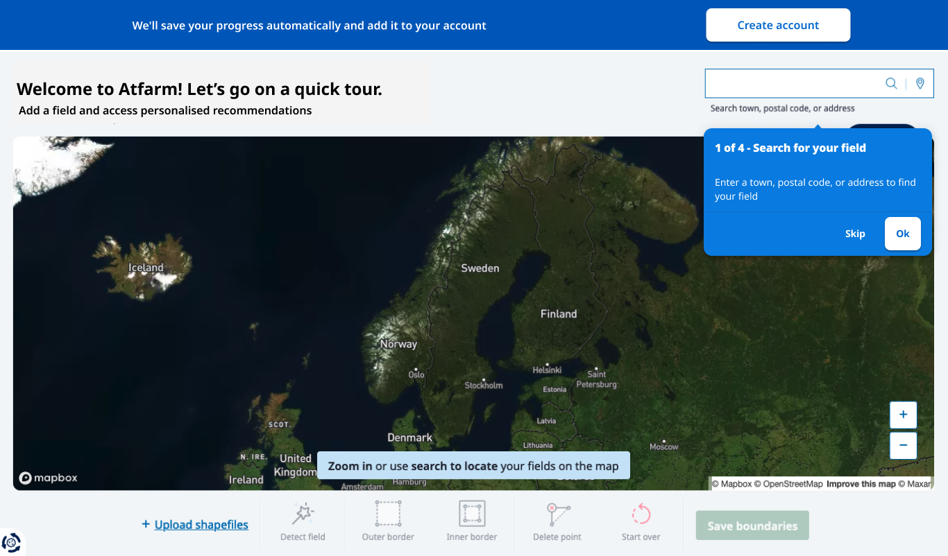
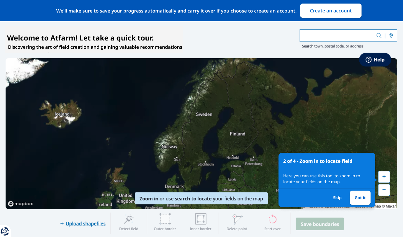
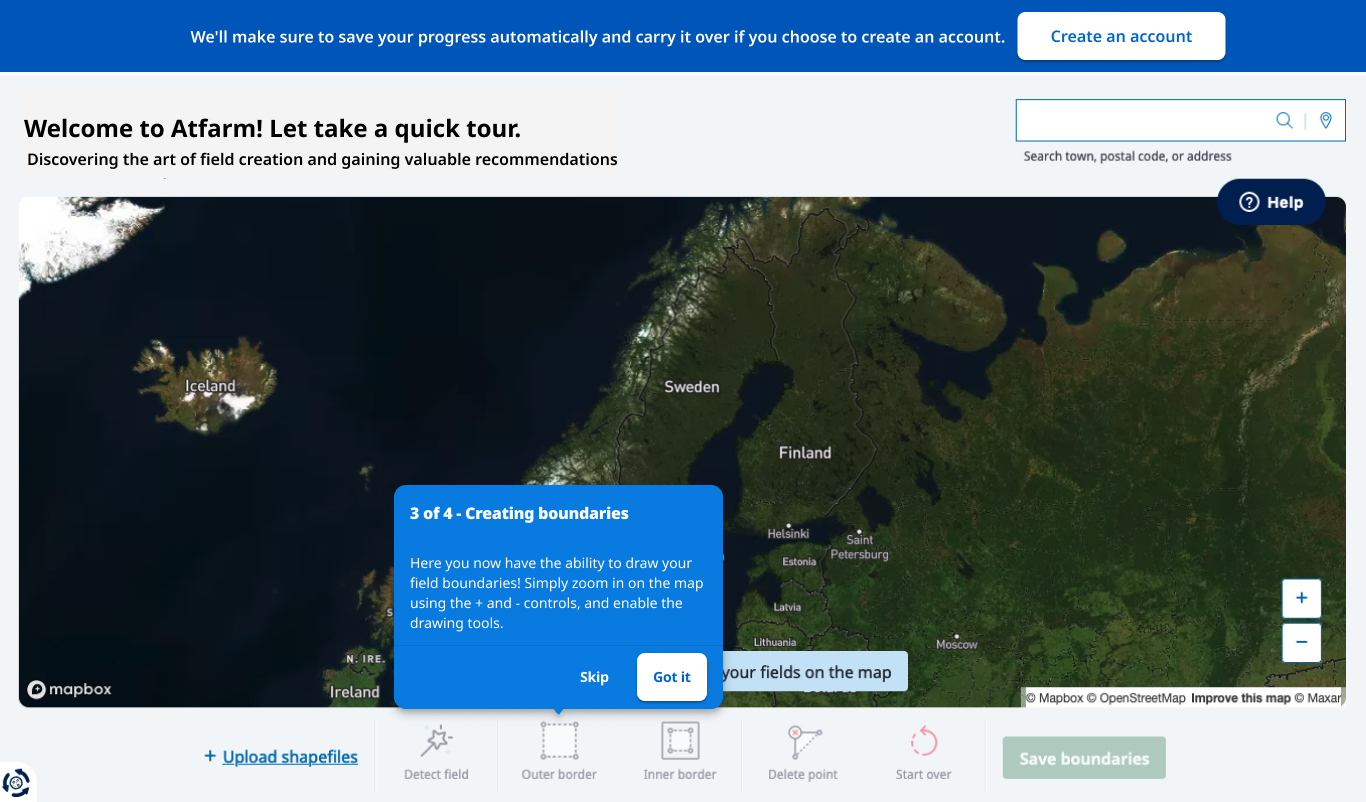
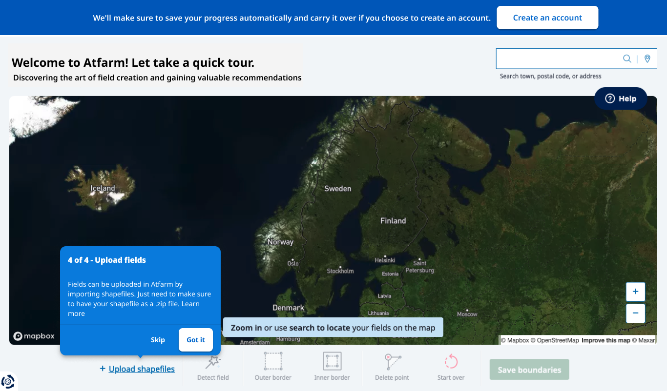
Added coachmarks for guidance.
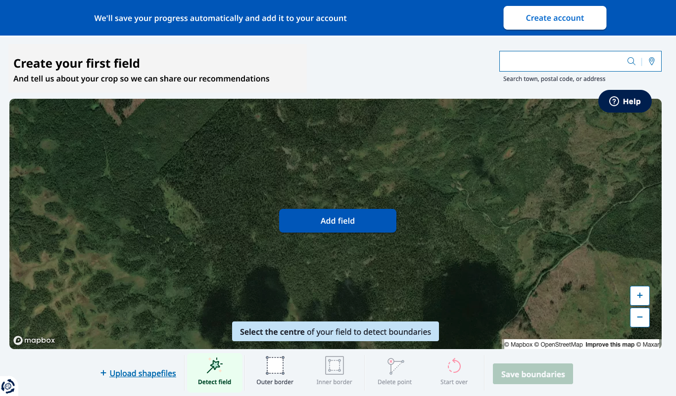
location detection for easier sign-up.
Optimized experience across mobile and desktop.
User Flows for the Webapp & Reactive Native Mobile
To explore how we can improve the flow and make the experience more engaging.


Validate Impact on Conversion
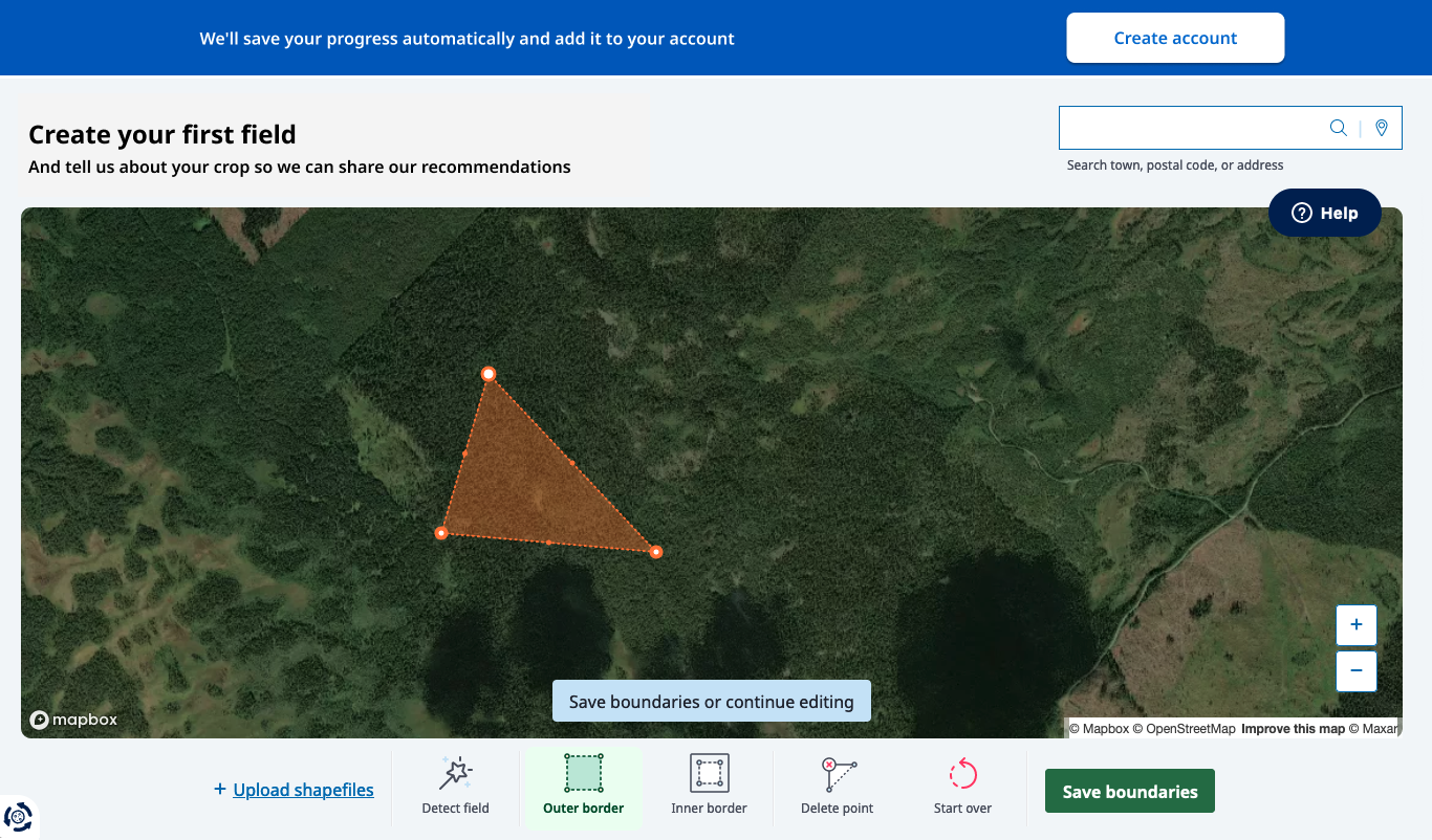
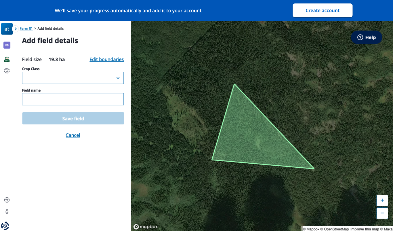
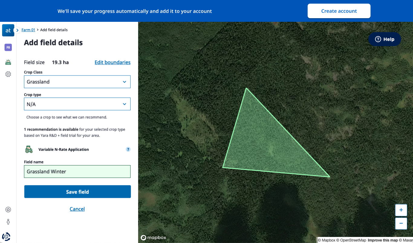
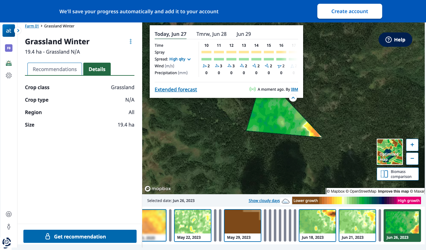
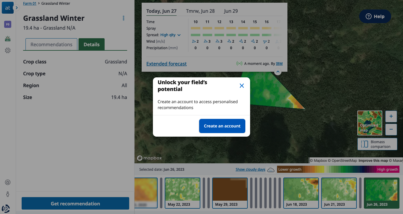
AB Testing: We also introduced a demo experience so first-time users could interact with the tool before committing to sign-up.
Achievements
We reduced sign-up drop-off from 80% to just 10%, resulting in a 70% increase in conversion rate.
Enhanced Usability – User research and testing ensured the platform was intuitive for both tech-savvy and traditional farmers.
Increase first field creation rate.
Stronger Brand Positioning – The design overhaul adapiting a Design System help consistency across desktop and mobile experience.


