Virgin Mobile UX/UI Interactive screen
Virgin Mobile - UX/UI Interactive screen
Won Gulf Best Digital Experience 2017
Overview - UX/UI Interactive screen
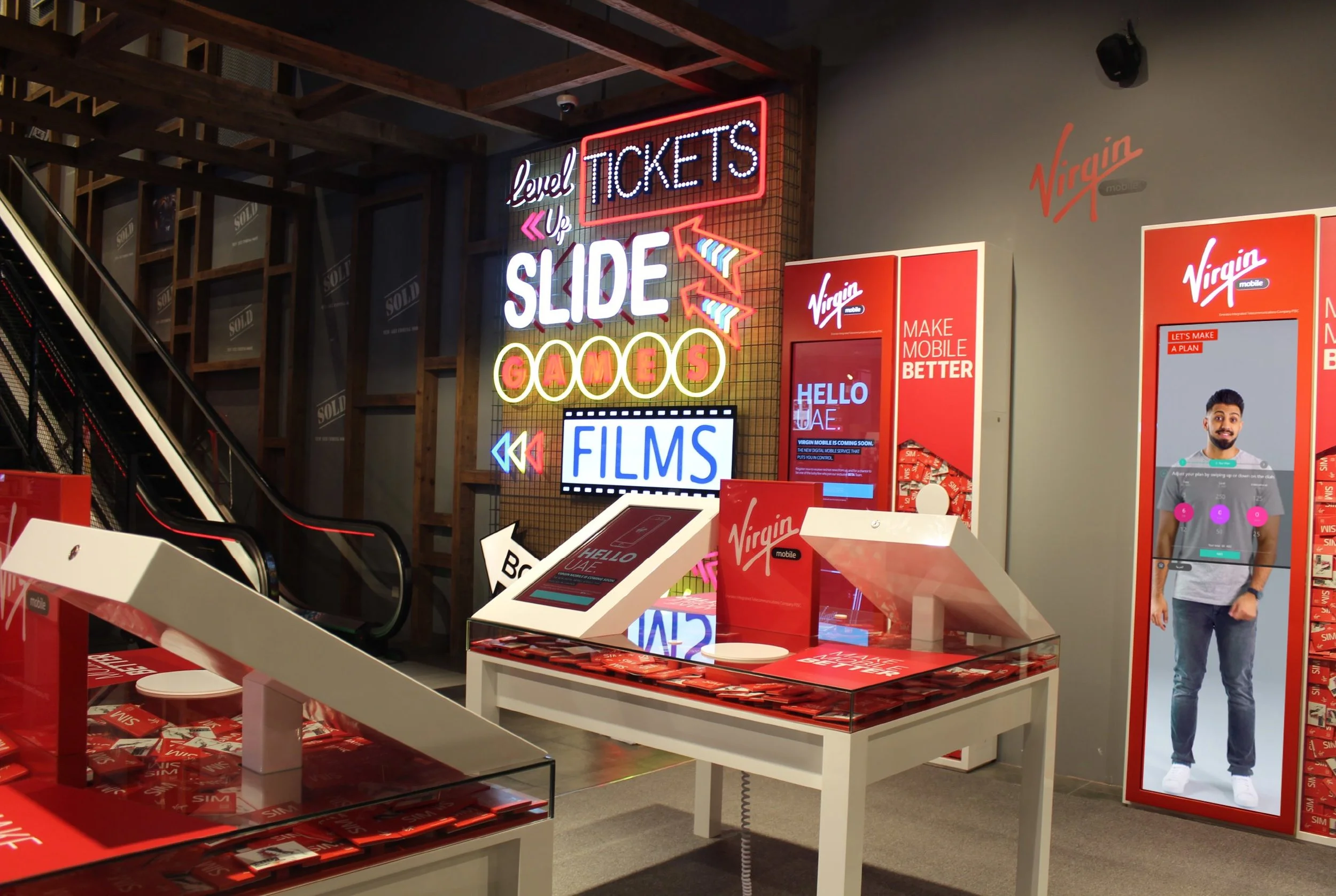
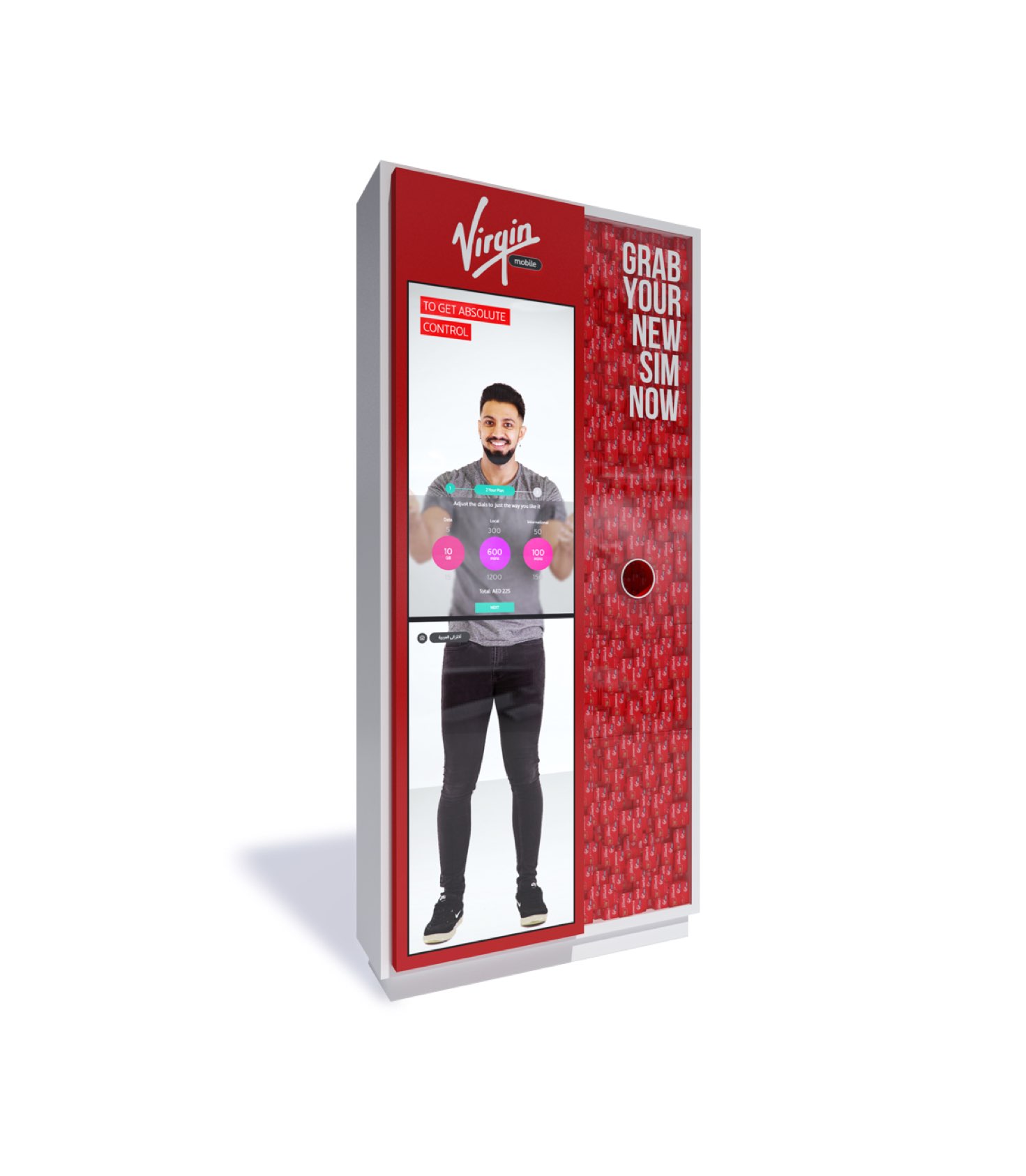
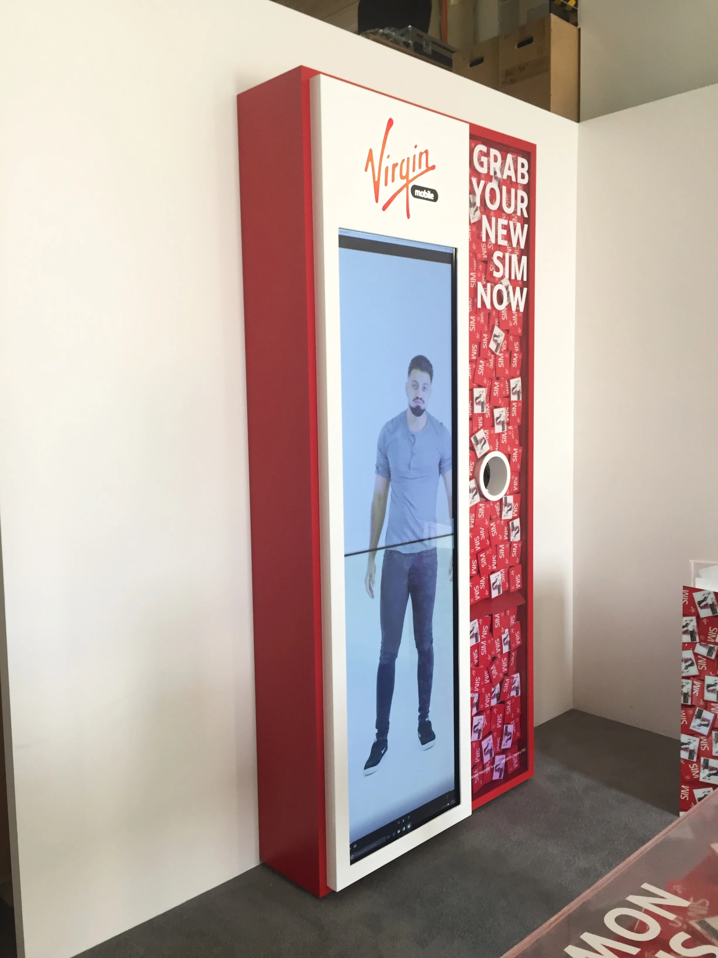
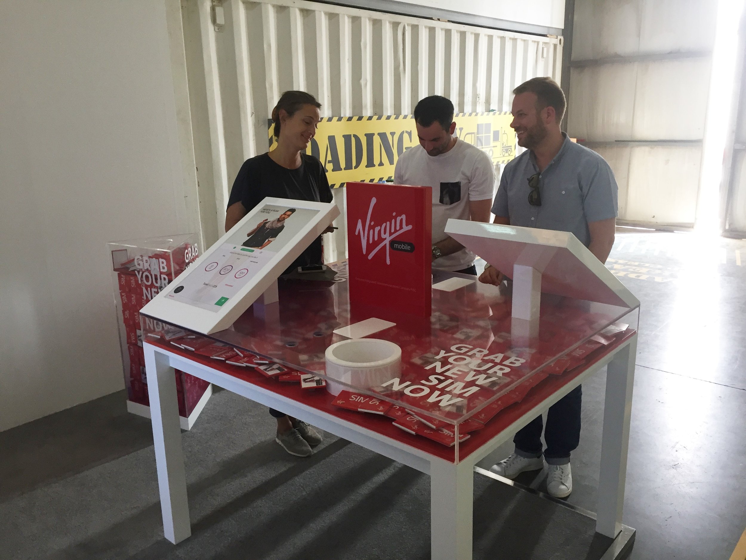
Working together with StartJG to create an innovative concept for Virgin Mobile in the United Arab Emirates. The differentiate service allows customers customize package and number, also allowing activation of the service from anywhere - home/office/store.
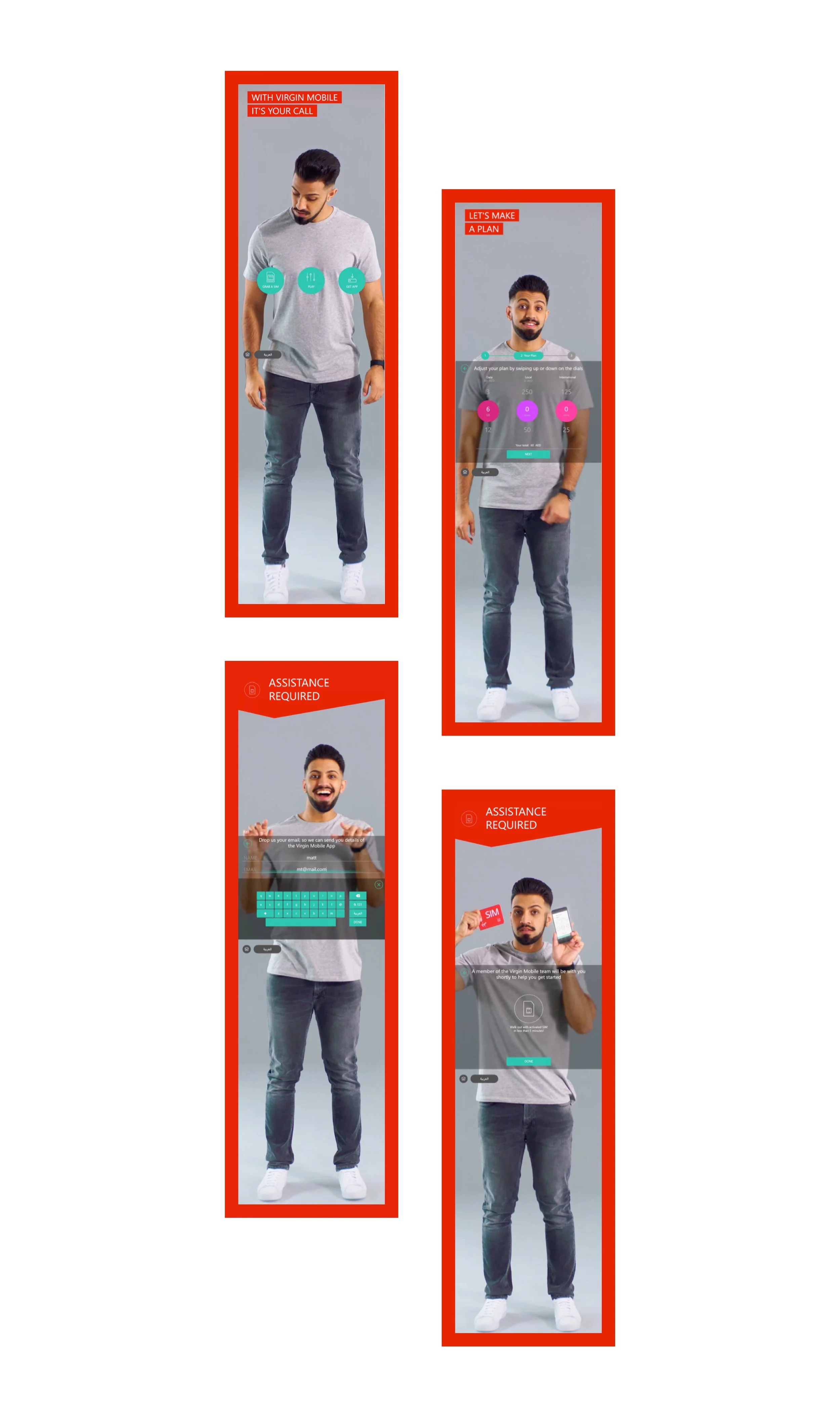
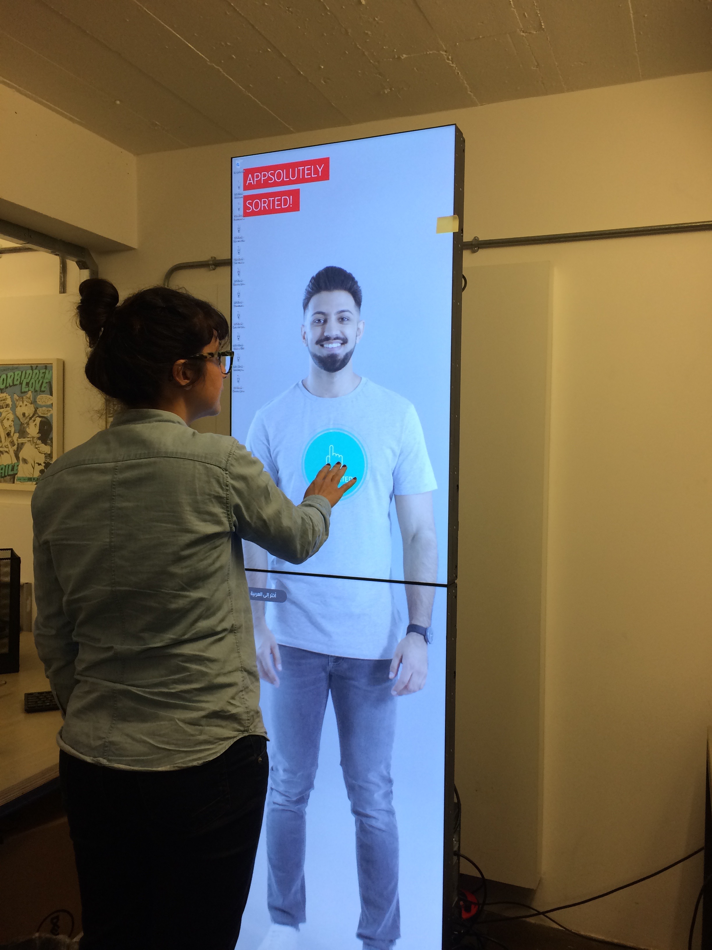
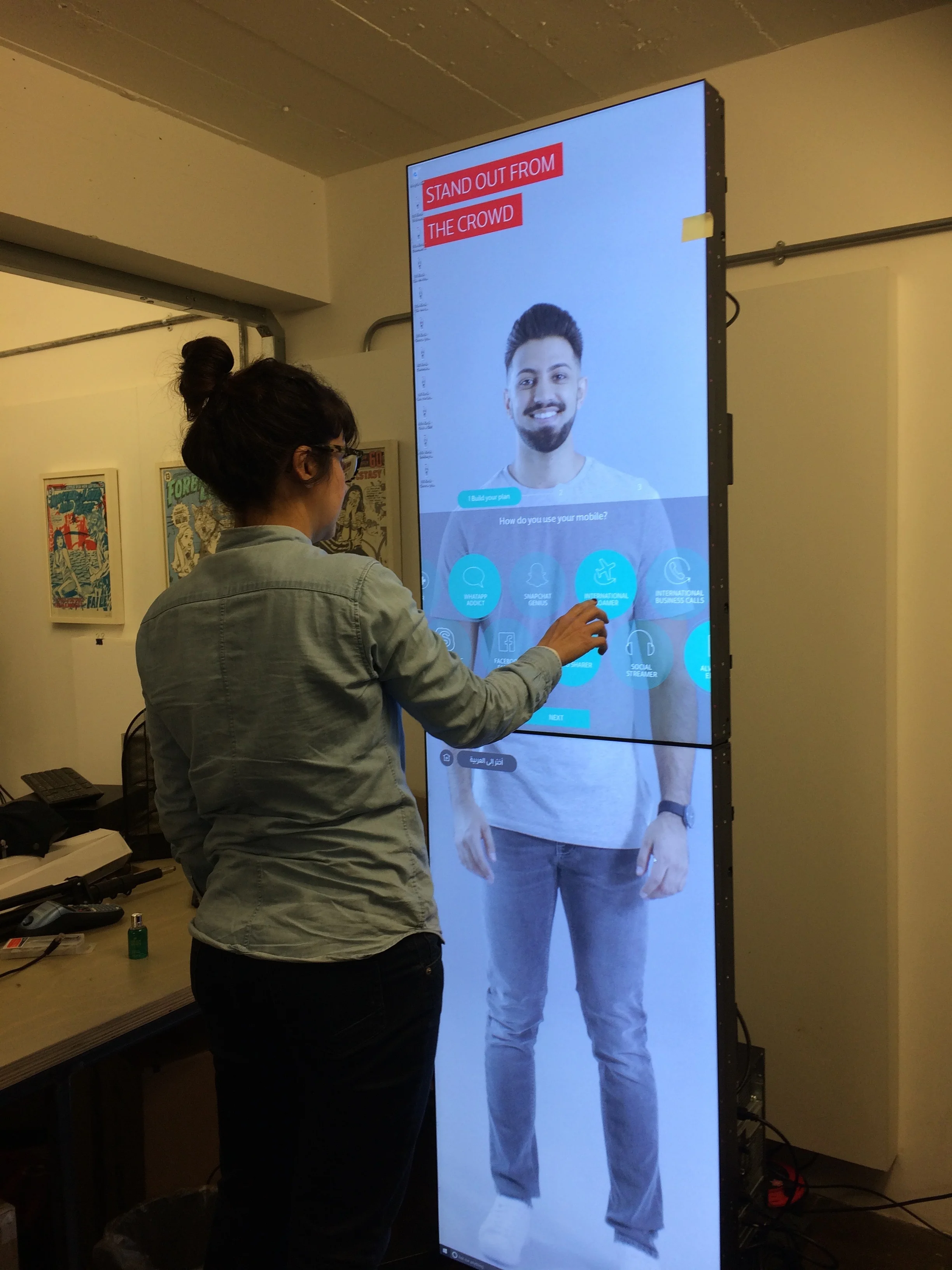
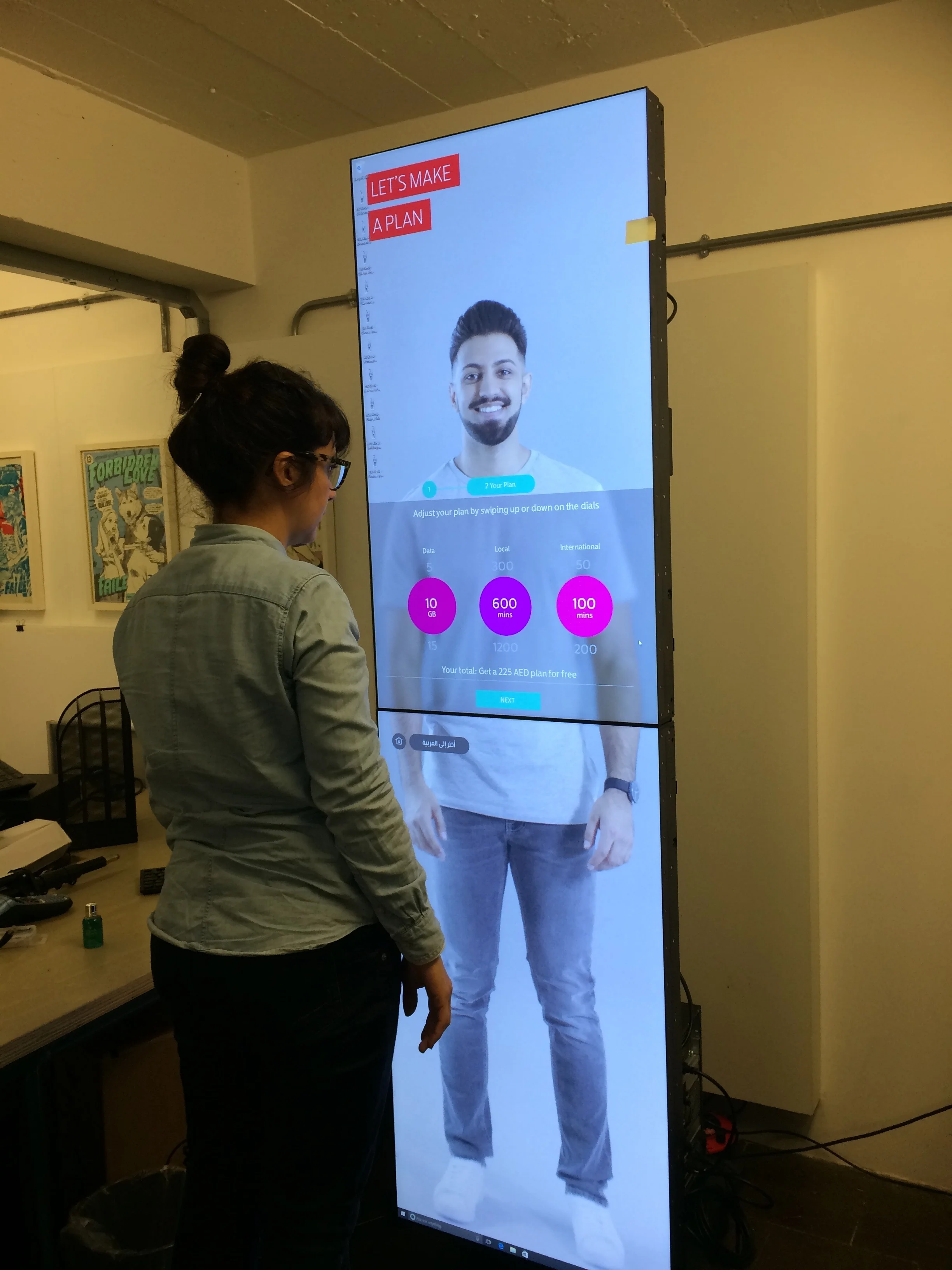
We wanted to create a unique customer experience, with a new sales system that would give the users control and customisation of the service. With that in mind, we decided to digitally humanize the experience of customisation and activation of a telecom service, by introducing a personal assistant to guide and help the customer going through the journey.
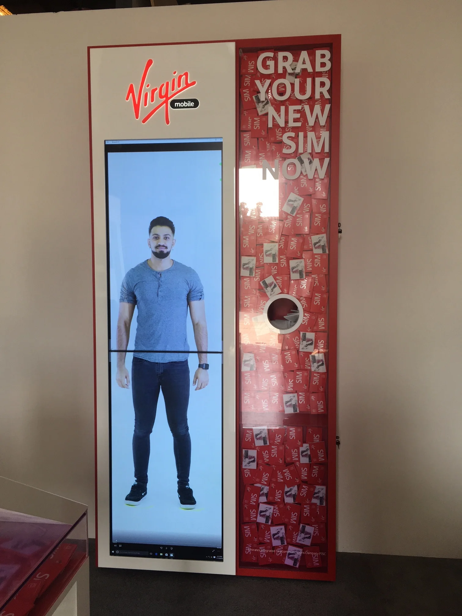
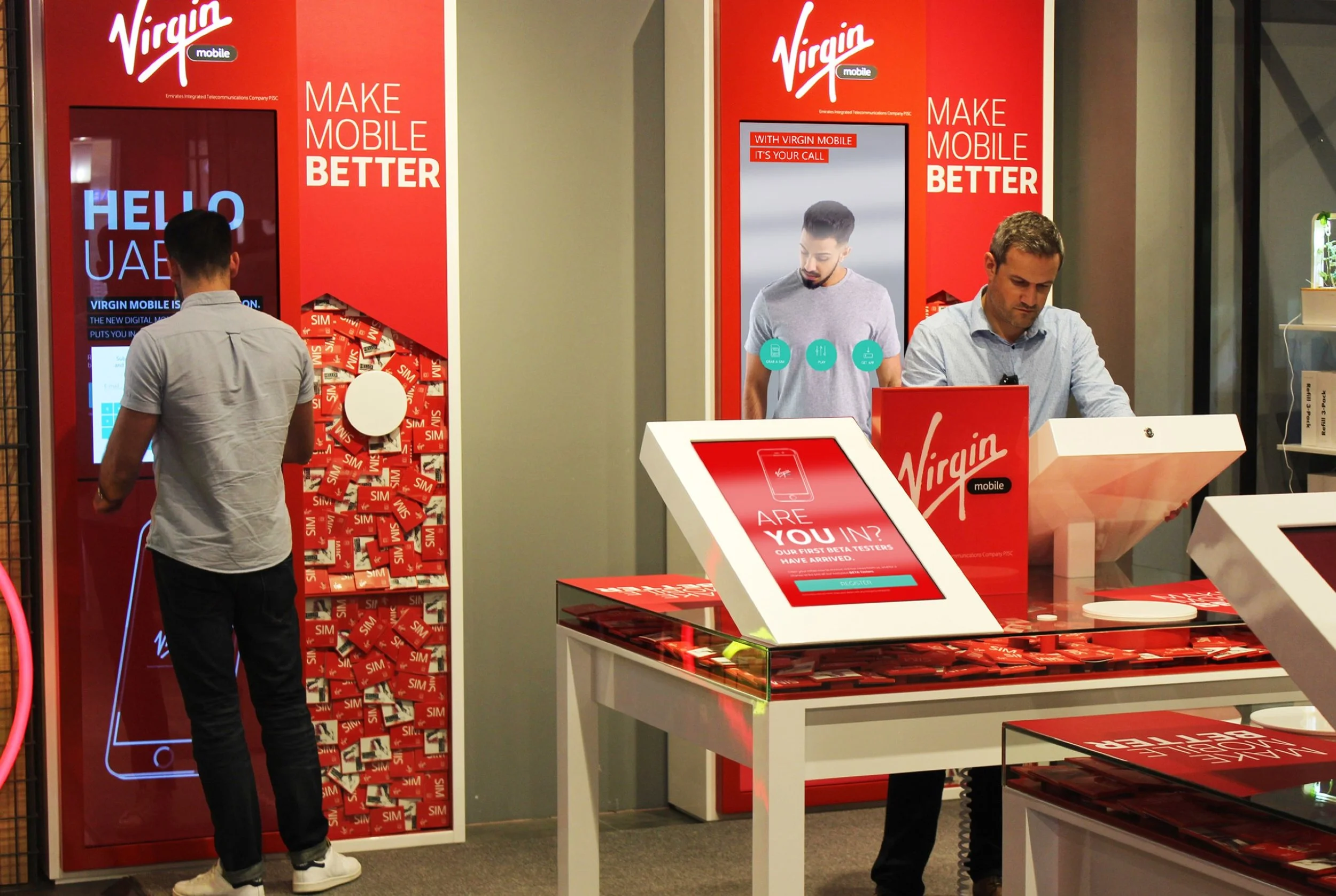
This interactive station is placed in a few stores around Dubai. The role project has been built in two languages Arabic and English.
The experience won the Gulf Best Digital Experience 2017.
My role
Reviewed all existing work and discussions with the client up to the point I joined the project.
Analysed brand guidelines to ensure consistency.
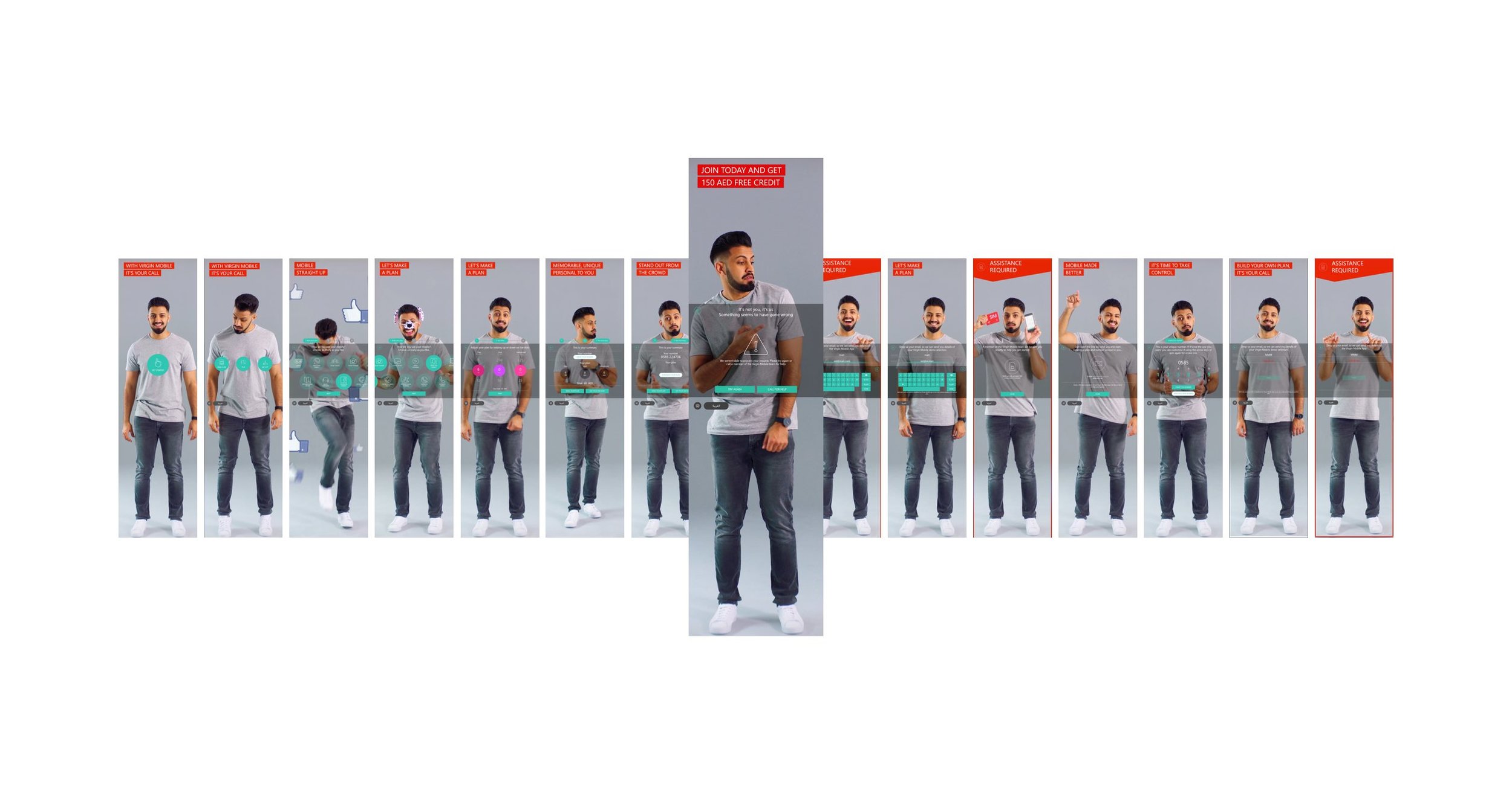
Began mapping out the customer journey to define key interactions
Created prototypes to validate the journey with the creative team, developers, and the client.
Designed digital assets, including UI elements (2D), for the interface.
Oversaw the photoshoot, directing interactions between the model and UI elements to ensure seamless integration.
Work closely with developers to deliver a final product we were proud of.
The Process
We started the project by identifying the following design goals.
1 - Attract, Engage and Enable the customer
2 - Pick the SIM, Collect information and Verify the user
3 - Demonstrate Customization and control
4 - Help shoppers understand the core product benefits
5 - Deliver a solution that is "Witty, Simple and Exuberant".
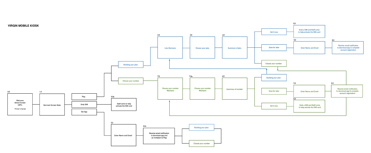
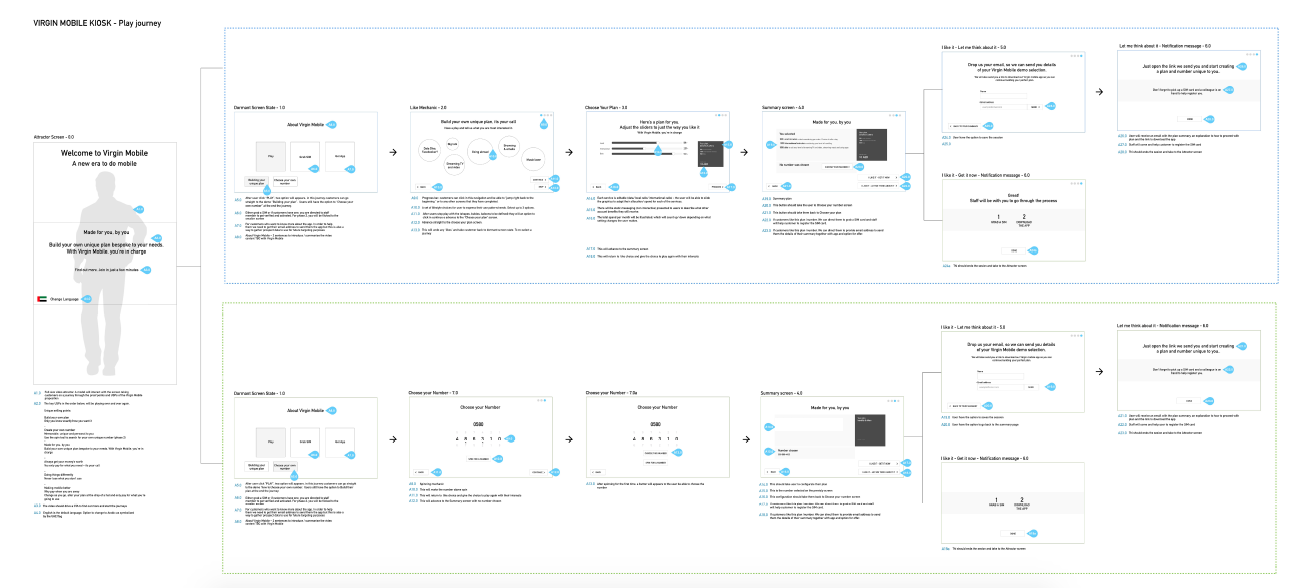
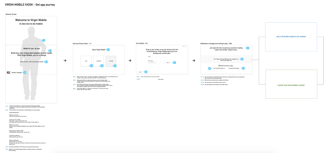
After identifying the goals I started work on User Flow, Wireframes, Design the interactive screen and helped direct the developers to create a unique experience for Virgin Mobile for new and existing customers.
Working together with the client, and the team at StartJG i created User Flows to help to identify the key screens and then started creating annotated wireframes.
Designs Outcome
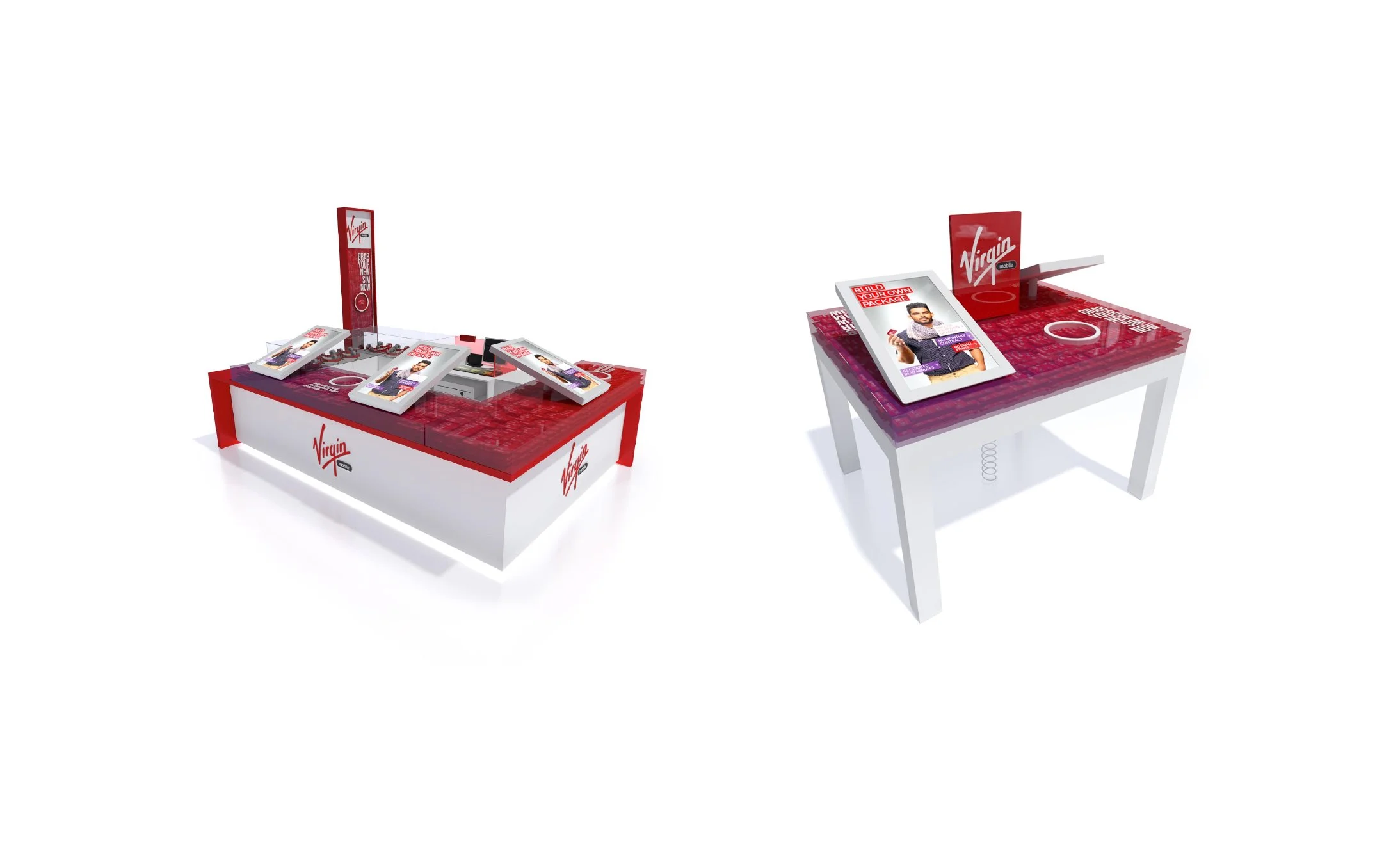
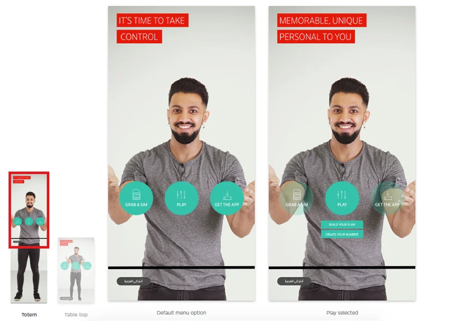
The designs started to get in shape after agreement on user flow and wireframes - for both totem and tabletop solutions.
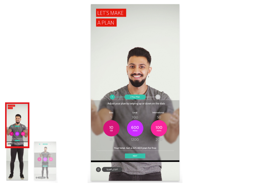
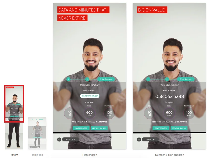
The UI has been designed to be used on both totem and tabletop screens with minimum adjustments.
The dimensions of main interaction for both screens are the same, whereas minor navigational elements are slightly different.
While being interacted, the upper most screen of the totem is outside user’s optimal field of view. This part of the screen is used to display message for the crowd other than the user.
Implementation/Testing
The Totem and Tabletop still in process of implementation in the stores.


